

7 ADA-Compliant Design Lessons I’ve Learned — and Why They Matter More Than Ever

ADA-compliant design is often treated like a checklist. What I’ve learned is that it’s actually about responsibility, cognition, and who we unintentionally exclude when we design without intention.
Lesson 1: Design Is Not About What We Like — It’s About Who It Works For
I get it.
We love certain colors.
We get excited about palettes.
We want things to look good, feel bold, feel expressive, feel like us.
I’m a creative. I understand that instinct deeply.
But what I’ve been watching—across websites, social media, branding, campaigns, and digital platforms—is a growing disconnect between what looks cool and what actually works for people.
And that disconnect has consequences.
Lesson 2: Color Theory and Typography Were Never About Aesthetics Alone
When I was studying advertising, one of the earliest things drilled into us was color theory and typography.
Not because it was trendy.
Not because it made things “pretty.”
But because color and type shape perception, behavior, comprehension, and access.
Color theory isn’t just about aesthetics.
Typography isn’t just about style.
They are about:
Psychology
Readability
Emotional response
Information hierarchy
Cognitive processing
And yes—accessibility
Back then, accessibility wasn’t framed the way it is now. ADA compliance wasn’t always named explicitly in every conversation. But the foundation was already there: design has responsibility.
What I’m seeing now is a lot of design that ignores that responsibility.
Lesson 3: Loving a Color Is Not a Design Strategy
I see it all the time:
Low-contrast text because “the brand color is soft”
Tiny fonts because “minimalism”
Text over busy images because “vibes”
Carousels packed with information because “engagement”
Videos without captions because “everyone watches with sound”
And I get the intention.
But intention doesn’t override impact.
When color contrast is poor, people with low vision can’t read it.
When typography is thin or decorative, screen readers struggle.
When information is cluttered, neurodivergent users disengage.
When videos lack captions, entire audiences are excluded.
ADA-compliant design forces us to ask a harder question:
Who does this actually work for?
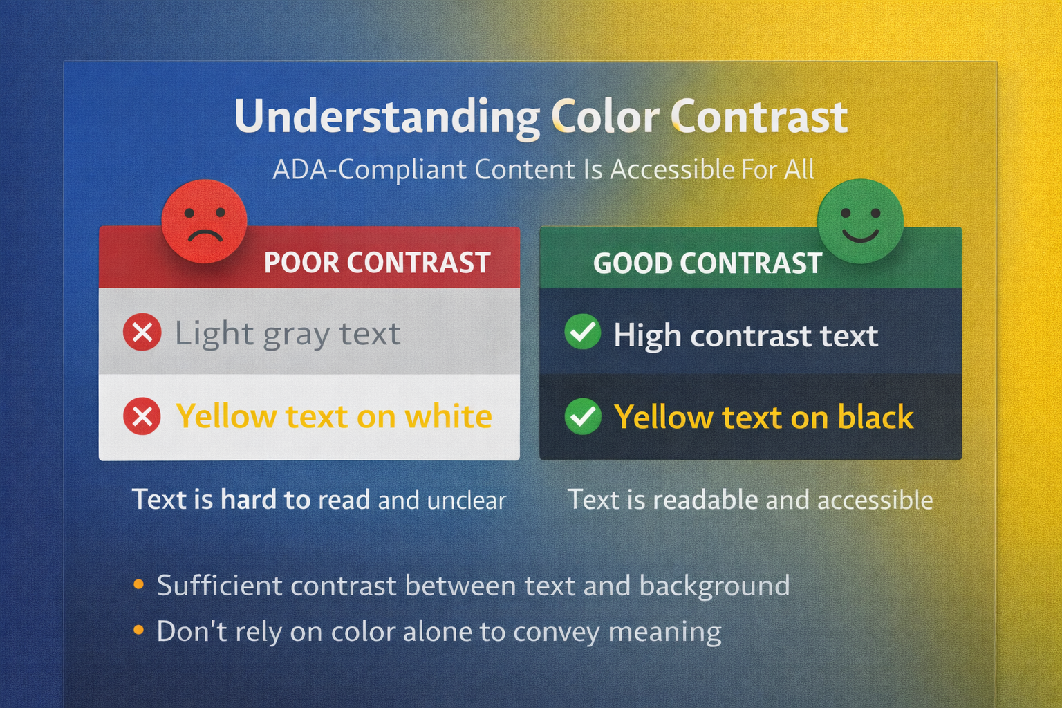
Lesson 4: ADA-Compliant Color Use Requires Responsibility, Not Preference
Color theory is powerful—but only when it’s used responsibly.
ADA-compliant color use means:
Sufficient contrast between text and background
Not relying on color alone to convey meaning
Designing for color blindness, not just full vision
Understanding how saturation and brightness affect legibility
Just because two colors look good together does not mean they are accessible together.
Design that prioritizes accessibility still allows for creativity—but it requires intentional choice, not preference-driven decisions.
Lesson 5: Typography Is an Accessibility Decision, Not Just Branding
Typography is one of the most overlooked accessibility issues I see.
Fonts communicate tone, yes—but they also determine:
Readability
Scannability
Cognitive load
Screen reader performance
Eye strain
Comprehension speed
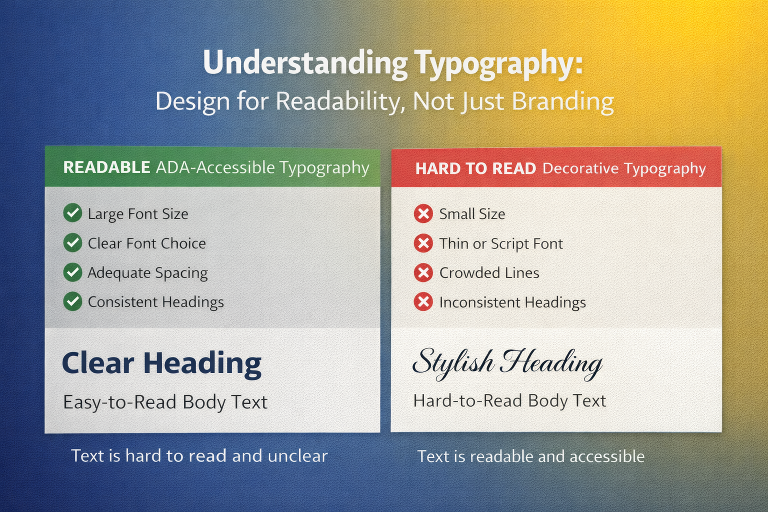
ADA-compliant typography considers:
Font size
Weight
Spacing
Line height
Clear hierarchy
Avoiding overly stylized or condensed fonts for body text
When type is difficult to read, people don’t “try harder.”
They leave.
Lesson 6: Accessibility Extends Far Beyond Websites
This is where a lot of people miss the point.
ADA-compliant design applies to:
Websites
Social media posts
Reels and videos
Emails
PDFs
Slide decks
Ads
Booking systems
Forms
Internal documents
If it’s digital, it’s part of the accessibility conversation.
Adding alt text, captions, clear structure, and readable layouts isn’t “extra work.”
It’s baseline responsibility in a digital-first world.
Lesson 7: Cognitive and Neurodivergent Accessibility Is the Missing Layer
This is the part I rarely see discussed—but I see the impact everywhere.
Accessibility isn’t only visual or auditory.
It’s cognitive.
That means designing for:
ADHD
Dyslexia
Anxiety
Trauma
Executive function challenges
Mental fatigue
Information overload
ADA-aligned design respects how people process information, not just how they see it.
Clear flow.
Predictable structure.
Plain language.
Less clutter.
Intentional pacing.
Accessibility is not about limiting creativity.
It’s about respecting the human nervous system.
Why This Matters to Me—and Why It Should Matter to You
This perspective doesn’t come from theory alone.
It comes from watching people struggle with digital spaces that were never built with them in mind.
Design that excludes isn’t neutral.
It sends a message—whether intentional or not.
And in this digital era, brands don’t just communicate through words.
They communicate through who can access them.
Final Thought
We can love color.
We can love bold design.
We can love expression and creativity.
But design without accessibility isn’t just incomplete—it’s irresponsible.
ADA-compliant design isn’t about checking boxes.
It’s about designing with awareness, education, and care.
And once you see it, you can’t unsee it.